

In 2026, users no longer browse the internet the way they did a few years ago.
Today, most people discover brands, shop online, consume content, and interact with businesses directly from their smartphones.
That means one thing for modern businesses:
If your website is still designed primarily for desktop users, you are already losing traffic, engagement, and conversions.
A modern website is no longer just “responsive.”
It must be built with a complete mobile first design strategy from the ground up.
This guide by DesignVity explains:
- Why mobile-first design matters in 2026
- Mobile usage trends
- Responsive design best practices
- Mobile user experience optimization
- Progressive enhancement techniques
- Common mobile UX mistakes businesses still make
If your business wants better SEO rankings, lower bounce rates, and higher conversions, mobile-first design is no longer optional.
What Is Mobile-First Design?
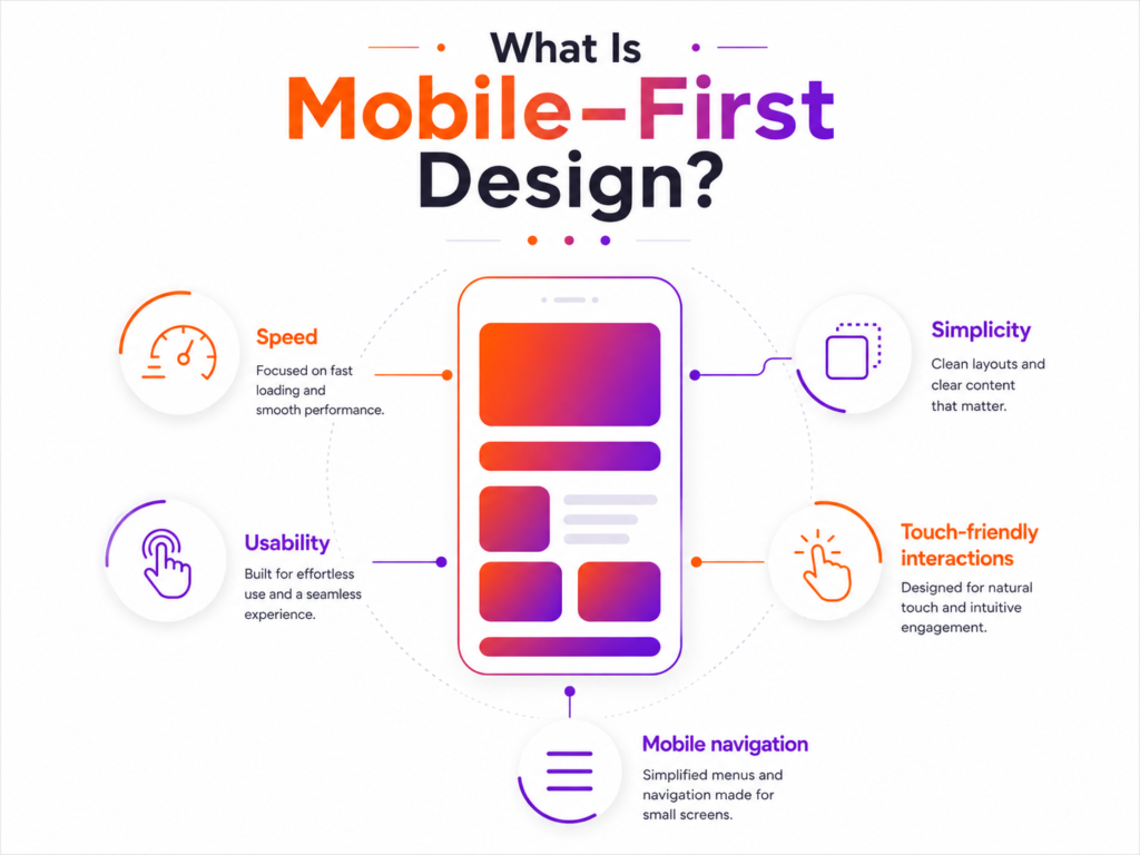
Mobile-first design is a web design approach where designers create the mobile experience before designing for desktop screens.
Instead of shrinking a desktop website to fit smaller devices, businesses now build websites specifically for mobile users first and then progressively enhance them for larger screens.
This approach prioritizes:
- Speed
- Simplicity
- Usability
- Touch-friendly interactions
- Mobile navigation
- Fast content consumption
Why Mobile-First Design Matters More in 2026
Mobile usage has completely transformed user behavior.
Modern consumers now:
- Browse products on mobile
- Watch videos on mobile
- Compare services on mobile
- Contact businesses on mobile
- Complete purchases on mobile
Google itself prioritizes mobile versions of websites for indexing and ranking through mobile-first indexing.
That means your mobile experience directly affects:
- SEO performance
- User engagement
- Lead generation
- Ecommerce sales
- Conversion rates
Mobile Usage Statistics in 2026
Recent industry reports show how dominant mobile traffic has become.
Key Mobile Trends
- Mobile devices account for the majority of global web traffic
- Users spend significantly more time browsing on smartphones than desktops
- Mobile ecommerce continues to grow year after year
- Poor mobile experiences dramatically increase bounce rates
Businesses that fail to optimize for mobile users often struggle with:
- Low conversion rates
- Poor engagement
- Slow website speed
- Weak search visibility
Why Desktop-Only Thinking Is Outdated
Many businesses still make a major mistake:
They design beautiful desktop websites and then “adapt” them for mobile later.
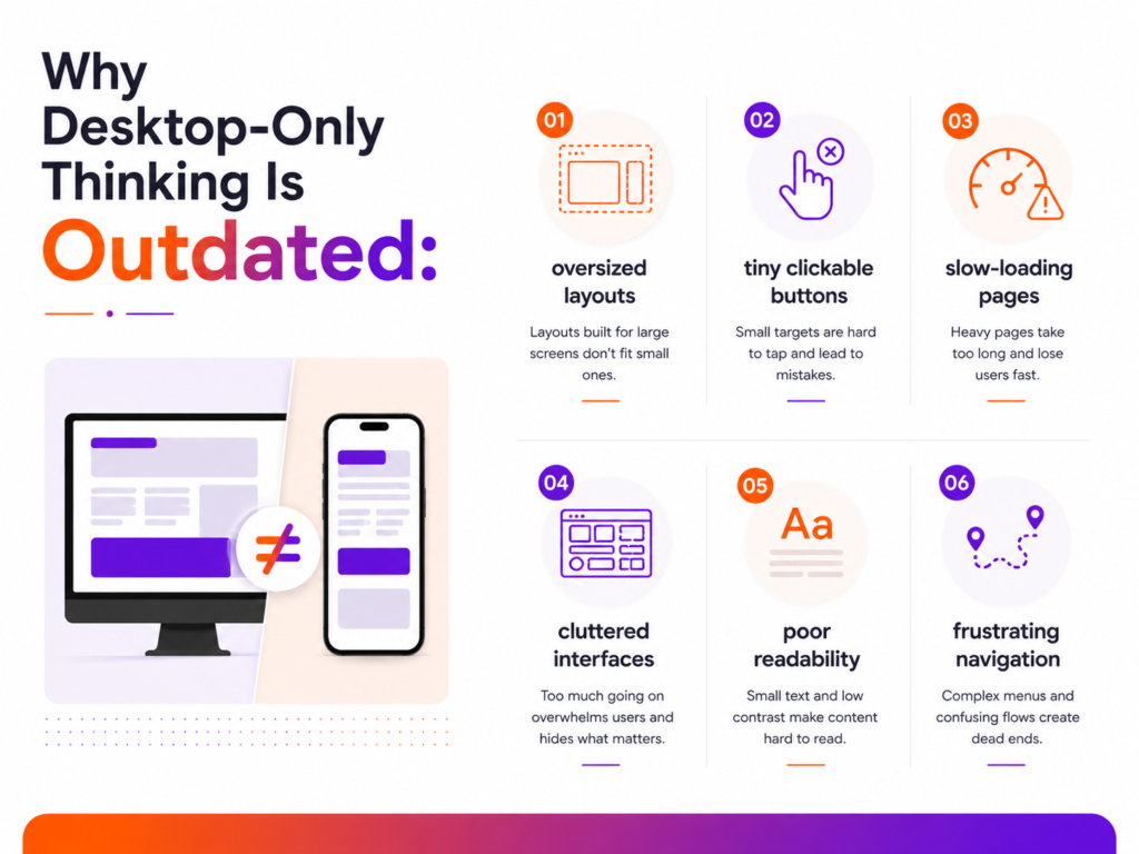
This creates problems like:
- Oversized layouts
- Tiny clickable buttons
- Slow-loading pages
- Cluttered interfaces
- Poor readability
- Frustrating navigation
Modern users expect frictionless mobile experiences immediately.
If they struggle to navigate your site on a phone, they leave within seconds.
The Shift From Responsive to Mobile-First
Responsive design was once enough.
But in 2026, businesses need more than basic responsiveness.
A true mobile-first design strategy focuses on:
- Mobile usability first
- Touch interactions first
- Speed first
- Simplified navigation
- Prioritized content hierarchy
Desktop becomes the enhanced version — not the starting point.
Responsive Design Best Practices in 2026
Modern responsive design is about more than flexible layouts.
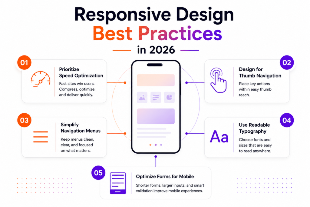
Here are the most important responsive design best practices businesses should follow today.
1. Prioritize Speed Optimization
Mobile users expect websites to load instantly.
Even small delays can reduce conversions dramatically.
Best Practices
- Compress images
- Reduce heavy scripts
- Use modern image formats
- Minimize animations
- Optimize fonts
- Implement lazy loading
Fast websites improve both SEO and user satisfaction.
2. Design for Thumb Navigation
Most users interact with websites using one hand.
Important buttons should be:
- Easy to reach
- Large enough to tap
- Properly spaced
Avoid tiny navigation links or crowded interfaces.
3. Simplify Navigation Menus
Complex desktop navigation rarely works on mobile.
Modern mobile navigation should be:
- Clean
- Minimal
- Easy to scan
- Touch-friendly
Too many menu options overwhelm users.
4. Use Readable Typography
Text must remain readable across smaller screens.
Recommended Guidelines
- Larger font sizes
- Better line spacing
- High contrast colors
- Shorter paragraphs
Mobile users scan quickly.
Clear typography improves engagement.
5. Optimize Forms for Mobile
Forms are one of the biggest mobile conversion problems.
Reduce friction by:
- Minimizing form fields
- Using autofill
- Enabling smart keyboards
- Simplifying checkout processes
Long mobile forms increase abandonment rates.
Mobile User Experience Optimization Strategies
Modern mobile UX focuses on reducing effort for users.
The easier your website feels, the better your performance becomes.
1. Prioritize Core Content
Mobile users want fast answers.
Your most important content should appear immediately without excessive scrolling.
2. Reduce Visual Clutter
Minimal interfaces perform better on smaller screens.
Avoid:
- Excessive popups
- Crowded layouts
- Unnecessary animations
- Too many CTA buttons
Clean design improves usability.
3. Improve Touch Interactions
Buttons, cards, sliders, and navigation elements must feel smooth and intuitive.
Users should never struggle to tap accurately.
4. Focus on Mobile Conversion Paths
Businesses should optimize:
- Mobile CTAs
- Lead forms
- Contact buttons
- Ecommerce checkout
- Click-to-call functionality
Every step should feel seamless.
What Is Progressive Enhancement?
Progressive enhancement is a design philosophy where businesses build a simple, functional experience first and then add advanced features for larger devices or faster connections.
This approach improves accessibility and performance across all devices.
Progressive Enhancement Approach in 2026
Step 1: Build the Mobile Foundation
Start with:
- Essential content
- Core navigation
- Fast-loading layouts
- Simple interactions
Step 2: Enhance for Tablets
Add:
- Improved spacing
- Larger layouts
- Additional interface elements
Step 3: Expand for Desktop
Finally include:
- Advanced visuals
- Expanded layouts
- Animations
- Complex interactions
This ensures the most important experience always works perfectly on mobile devices first.
Common Mobile Design Mistakes Businesses Still Make
Even in 2026, many websites still struggle with poor mobile optimization.
1. Slow Website Speed
Heavy animations and unoptimized assets destroy mobile performance.
2. Tiny Clickable Elements
Buttons that are difficult to tap frustrate users instantly.
3. Intrusive Popups
Aggressive popups interrupt mobile browsing experiences.
4. Poor Content Hierarchy
Important information hidden below excessive content increases bounce rates.
5. Desktop-Centered Layouts
Designing for desktop first often creates awkward mobile experiences.
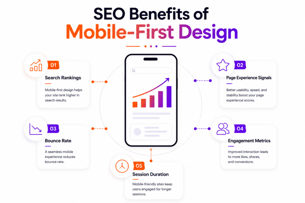
SEO Benefits of Mobile-First Design
A strong mobile experience directly impacts SEO performance.
Google prioritizes mobile usability when evaluating websites.
Better mobile optimization can improve:
- Search rankings
- Page experience signals
- Bounce rate
- Engagement metrics
- Session duration
Mobile-first design also supports local SEO because mobile users frequently search for nearby businesses and services.
Why Startups and Growing Brands Need Mobile-First Thinking
Startups often compete with larger companies that already dominate search and advertising.
A faster, cleaner mobile experience can become a major competitive advantage.
Mobile-first websites help businesses:
- Increase conversions
- Reduce bounce rates
- Improve ad performance
- Improve SEO
- Generate more leads
- Create better customer experiences
This is especially important for:
- SaaS businesses
- Ecommerce brands
- Local businesses
- Agencies
- Startups
The Future of Mobile UX in 2026
Mobile experiences are becoming more:
- Interactive
- AI-assisted
- Voice-enabled
- Gesture-based
- Performance-focused
Users now expect:
- Instant loading
- Smooth interactions
- Simplified interfaces
- Frictionless navigation
Businesses that fail to adapt risk losing both visibility and customer trust.
Final Thoughts
Desktop websites are no longer the primary digital experience.
Mobile is now the default.
A successful mobile first design strategy focuses on:
- Speed
- Usability
- Touch-friendly navigation
- Responsive layouts
- Optimized mobile conversions
Businesses that prioritize mobile user experience optimization in 2026 will outperform competitors still relying on outdated desktop-first design approaches.
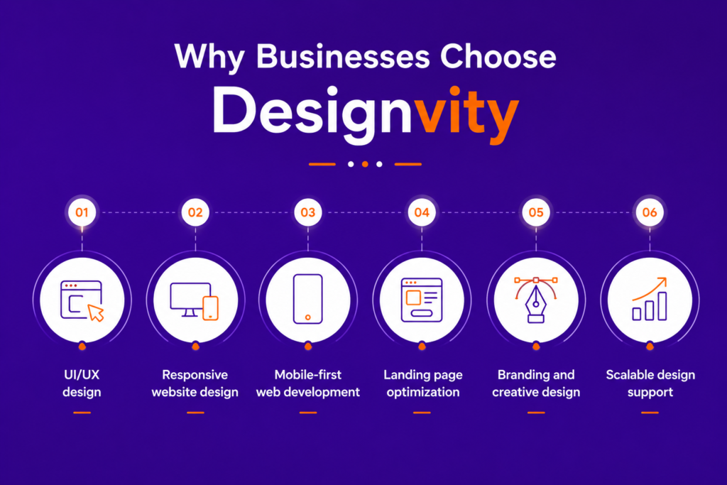
Why Businesses Choose Designvity
DesignVity helps startups, agencies, SaaS companies, and growing brands create modern mobile-first digital experiences that improve performance and conversions.
Our services include:
- UI/UX design
- Responsive website design
- Mobile-first web development
- Landing page optimization
- Branding and creative design
- Scalable design support
Whether you need a high-converting landing page or a complete mobile-first website redesign, DesignVity helps businesses build faster, smarter, and more user-focused digital experiences.
FAQs
What is mobile-first design?
Mobile-first design is a strategy where websites are designed for mobile devices first before being expanded for desktop screens.
Why is mobile-first design important in 2026?
Because most users now browse, shop, and interact with businesses through smartphones, making mobile usability critical for SEO and conversions.
What are responsive design best practices?
Best practices include fast loading speed, touch-friendly navigation, readable typography, simplified layouts, and optimized mobile forms.
What is mobile user experience optimization?
It involves improving usability, speed, navigation, and interaction quality specifically for mobile users.
What is progressive enhancement in web design?
Progressive enhancement means building a simple mobile experience first and then adding advanced features for larger devices and better connections.